![]()
Tag Archives: colors
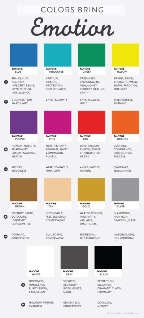
Colors Bring Emotion – Infographic
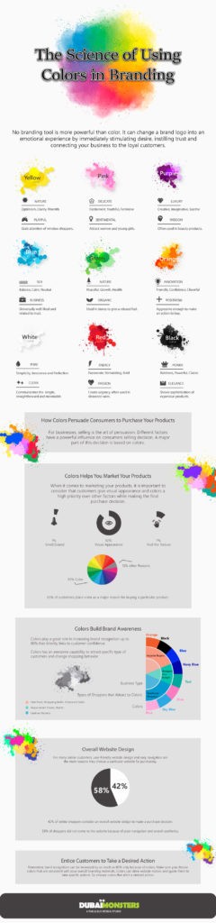
The Science Of Using Colors In Branding – Infographic
Design And Colors. The Symbolism And Color Psychology Of Common Colors

Color is a magical element that gives feeling and emotion to art, design, and advertising. By understanding color meaning, (or the psychology of color) you can choose the right color to support and emphasize your design.
A dominant color or overall color scheme can determine the tone of your document. Certain colors will help your product, corporate document, or advertisement attract specific target audiences and evoke desired responses.
The information below provides generally accepted guidelines on the symbolic meanings of color and how you can use color more effectively in your marketing pieces.
The meaning of the color yellow (including coral, orange, amber, gold)
What it Symbolizes: Energy, caution, warmth, cheer, joy
Yellows are often associated with the following characteristics: homey, friendly, soft, welcoming, moving, excitement, or adventure. Good for press kits, stationery, and shopping bags.
Use yellow for signage in work situations warning of danger. Yellow is also good for any project that needs to evoke feelings of lightheartedness, humor, or friendliness.
The meaning of the color red (including mauve, magenta, crimson, scarlet, poster red)
What it Symbolizes: Power, romance, vitality, earthly, energy
Reds evoke highly charged emotions such as aggression, danger, or love. Red makes us pay attention and catches our eye immediately so use reds on items that need to grab attention.
In the financial arena, red symbolizes a negative direction.
The meaning of the color green (including lime, leaf green, sea green, emerald, teal, sage)
What it Symbolizes: life, foliage, grass, trees, water
Greens are sensuous and alive. Green is associated with the following characteristics: friendliness, dependability, freshness, non-threatening, safe, secure, healthy, strong, expensive, and primitive.
In the business world, green symbolizes growth and prosperity.
The meaning of the color blue and purple (including sky blue, ultramarine, violet, purple, azure)
What it Symbolizes: Peace, law and order, logic, analytical, intelligent, honest, calm, clean, good will, tranquility, compassionate, serious, thoughtful, quiet, reflective, regal, classic, dependable, trustworthiness, tradition, magical.
Blues are often used for older, more mature audiences and situations. Blue is common in financial institutions, hospitals, and legal and medical professions. Purples have long been associated with royalty, magic and power. Purples are often used with feminine, rather than masculine designs.
Make sure the colors you use in your marketing materials attract the attention of your target market. Check color resource design guides or swatch books to discover what color combinations work best to make your designs pop.
The Impact of Colors in Advertisements


Human brain receives signals faster through eyes rather than ears. Visual appearance is supposed to be more appealing when compared to any other senses, no matter what the medium of presentation is. So, there are methods by which one can increase the visual appeal. Other senses facilitate visual appeal, and are also important to concentrate on.
Typical example is color when accompanied with audio, and writing. According to a study, big budget companies spend billions in the color market research, which helps in product and packaging development. Color, along with content, helps to pertain the interest of the visitor and makes him surf the website longer. A colorful article will make the reader read it till the end. Color makes things look more amiable.
Colors are known to influence the behavior of a person. Like blue color is said to have a relaxing effect. Red represents passion and love. A dating website can have red as the background color. Fast food restaurants have bright picture of food beautifully decorated pasted on the walls. This tempts the taste buds of the customer and the customer pounces on the food, eats and leaves quickly. And this is exactly the reaction expected.
Light effects can also be used to play with the mind of the on-looker. Advertisements, especially for food products, have strategically placed lights. The light effects trigger the hormones in the brain, which increases the hunger. If the same is placed in a slightly dim light, it won’t be equally tempting.
Countries around the world have different cultures that relate a color to an occasion or emotion. Climatic conditions also attribute to this. Like in America, people relate black to death and where as in Asia, white is related to death. People living near the equator like warm colors and people living nearer to the poles like cold colors.
It’s a must for an advertiser to have the knowledge about the colors and what they refer too. Black stands for elegance, sophistication, seduction and mystery. White stands for peace, pure, clean, mild and youthful. Gold stands for prestige, luxury and elite. Silver stands for prestige, scientific and cold. Yellow stands for warmth, happiness and cheer. Orange stands for warmth, playfulness, and vibrant. Red stands for love, excitement, strength, passion, and danger. Pink stands for nurture, sweet, soft, and security. Green stands for nature, fresh, fertility and abundance. Blue stands for cool, trust, belonging and reliability. And lastly Purple stands for spiritual, royalty, and dignity.
From the advertiser’s point of view, we can conclude that colors can determine the shopping habits of customers. Black, blue, red and orange attract impulsive buyers. Smart shoppers are attracted to pink, light blue and navy blue colors. Companies use colors in logo, advertisement, etc., to pass the right message to the customer. Wal-Mart advertise has a navy blue background and its catch line is “We sell for less”, which means smart customers are their goal. Mercedes has a silver logo, true to its class.
Before designing an advertisement, the targeted customers should be recognized and the advertisers shouldn’t use the colors that are their personal favorites but according to the ad campaign. Advertisement for children should have bright and vibrant colors. Yellow, red, blue and green, which are the primary colors, are the colors, which attract the children, which is why parents buy those colors for their kids. These colors represent warmth, sweetness, trust, reliability, playfulness and security.